This article explores different ways to show a Pricing Table Widget on your website, from simple plan cards to detailed comparisons. You’ll learn how to choose a display that helps visitors understand your prices, compare options, and take the next step.
Visitors may hesitate when they cannot quickly understand what your plans include or how much they will pay. Choosing the right pricing display makes your offer easier to understand and helps people find a plan that fits their needs.
Many website owners squeeze every feature into their pricing table and make it difficult to scan. Others show a monthly price without clearly explaining the yearly payment required. Start by making the price, main benefits, and billing terms easy to find.
Your pricing table should make choosing easier than asking questions.
Put Plans Side by Side
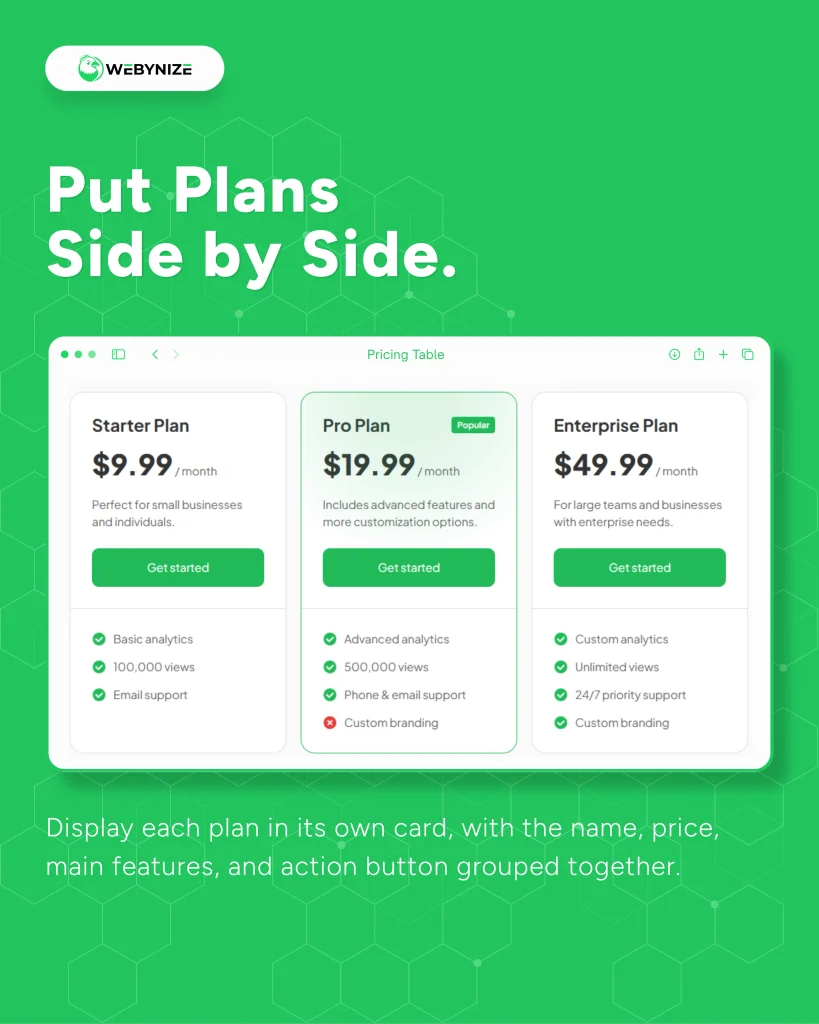
Display each plan in its own card, with the name, price, main features, and action button grouped together. Keep cards beside each other on wider screens and stack them on phones so the text stays readable.
Buffer presents Starter, Pro, and Enterprise plans on its pricing page. Each plan groups its pricing, included features, and signup option together. You can follow that structure when building a card for each of your offers.
Use plan cards when visitors need a quick overview of a few clear options.
Let Features Line Up
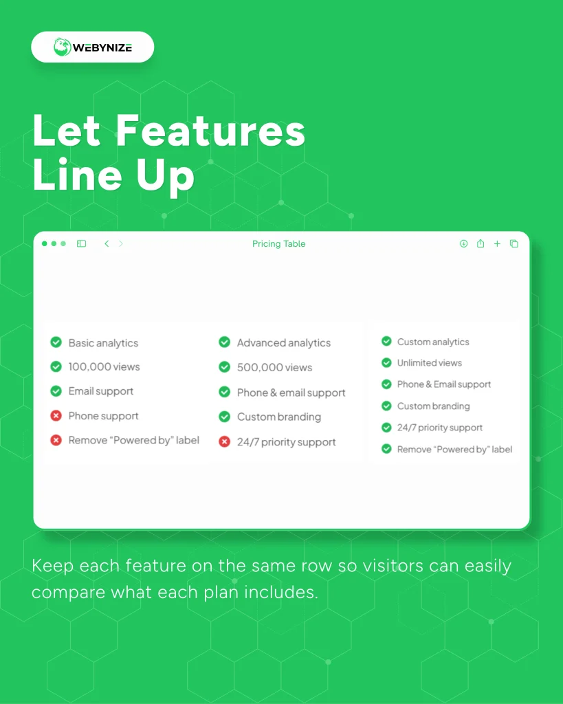
Use a comparison grid with plans across the top and features down the side. Keep each feature on the same row so visitors can easily compare what each plan includes.
Slack includes a detailed feature comparison below its plan summaries. It groups features into sections such as collaboration, automation, and security. Your pricing display can use the same approach when buyers need more detail before choosing.
Choose a comparison grid when feature differences are central to the buying decision.
Make Billing Switchable
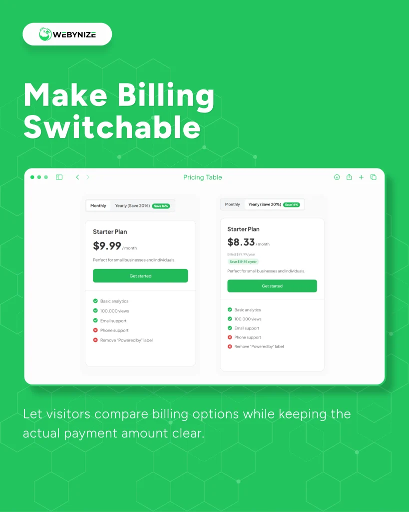
Add a monthly and yearly switch so visitors can compare payment options without leaving the pricing table. For yearly plans, show the total annual charge alongside any monthly equivalent.
Buffer places monthly and yearly billing controls above its plans. Its yearly pricing also states the amount billed annually. That combination offers a useful model for showing payment choices without leaving visitors to calculate the full cost.
Let visitors compare billing options while keeping the actual payment amount clear.
Give One Plan the Spotlight
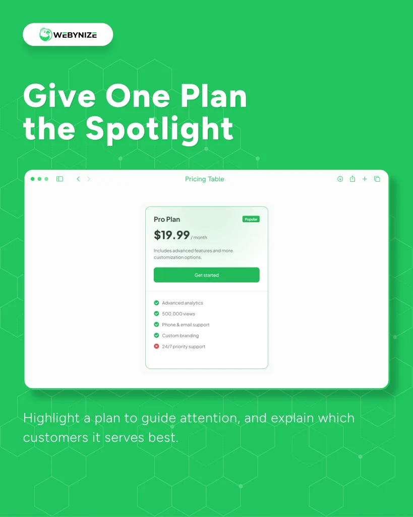
Highlight a recommended plan with a clear label, border, or background color. Explain who it suits so visitors understand the reason for the recommendation.
Wix marks its Business plan as recommended on its pricing page. The surrounding plans remain available for visitors to compare. You can adapt that approach by giving one suitable option extra attention while keeping every choice easy to read.
Highlight a plan to guide attention, and explain which customers it serves best.
Separate Different Buyers
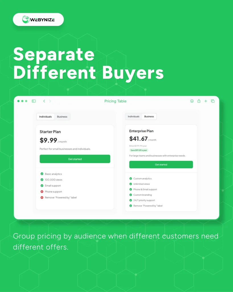
Place separate pricing tables under clearly labeled tabs when you serve different customer groups. This lets visitors focus on relevant offers without comparing plans meant for someone else.
Adobe’s Creative Cloud pricing page includes sections for individuals, students and teachers, and businesses. Each group has offers with different terms and benefits. Your website can use similar tabs to organize pricing for distinct audiences.
Group pricing by audience when different customers need different offers.
Make Updates Easier
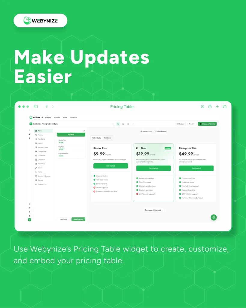
Use Webynize’s Pricing Table widget to create, customize, and embed your pricing table. Choose one that lets you update plans from a dashboard so you can maintain your pricing without editing each page.
Stripe offers an embeddable pricing table that businesses configure through its dashboard. Users select products, customize the display, and copy the generated code into their website. This provides a practical example of how a reusable pricing tool can simplify publishing and managing offers.
Use the Pricing Table Widget from Webynize to customize your pricing display and manage updates from one place.
Help Visitors Choose With Confidence
A Pricing Table widget helps visitors compare plans, understand what they get, and choose the right option with less confusion while helping your team answer fewer pricing questions and close more sales. I suggest you create a free Pricing Table widget and place it on the parts of your website where visitors decide, like your pricing page or homepage. Make your plans clear and easy to compare, and visitors will feel more confident about choosing your business.
Leave a Reply